Friday, 1 June 2012

different


I haven't drawn an actual human person in probably a year. Maybe even longer than that. So when my good friend Pav (this is for you, baby!) inquired about my illustration I decided to do something totally different, go a little bit crazy and attempt to draw one. I guess it's what you would call a fashion illustration, and I was inspired by the grunge and pastel trends (I now want this hair) and wanted to kind of bring them together.

 I can't decide if this is finished yet, but I got quite excited about it and wanted to share it - maybe you could tell me if you think it looks finished? Personally I'm not sure about the background, or if she needs something solid to be sitting on? I based the pose loosely on a photograph of myself, and I really felt that working from a good reference photo made this much easier! enjoy.

Tuesday, 29 May 2012

summer


It's been a little while! I've had an idea in my head for the past week or so and this is kind of the manifestation of it. I've been looking at ways to use the scrollwork I've been fascinated by as well as meaning to create a piece with the phrase "one swallow does not a summer make" ever since this summer began. This led me to looking at and researching vintage tattoos, Sailor Jerry Collins style, and this was what I came up with. Really been enjoying the tattoo ink style since I did my valentine piece a couple of months ago, so I may try a few more vintage tattoo style drawings. Hope you like it!

Saturday, 21 April 2012

Creatives

Just a quick post to share a feature with you all - A couple of weeks ago I was featured on a site called The Young Creatives, a great fledgling collection of artists, designers, crafters and other creative types. Their site is chock full of fabulous folks and it's a great way to connect to other artists. They did a small feature on my work  which you can read here.


They also featured a good friend of mine and fab illustrator Natasha Aldred, whose feature you can look at here. As well as featuring on artists and creatives, they also share interesting articles and event details for the artistic community. Go have a browse!

You can follow The Young Creatives on twitter, at @t_yc. To see blog updates and new works you can also follow Natasha, @natasha_aldred.

Monday, 16 April 2012

Costumes

Over the past couple of months I have been working on designing the branding and website for a small venture I am personally involved with called The Costume Cellar. Over the years our family and friends have accumulated through various channels dozens and dozens of brilliant costumes that have all ended up in a collection in our cellar, and we have decided to share these costumes with the public in the form of a costume hire service.


I posted a blog at the very start of this venture while I was designing the first logo for the Costume Cellar. Since then, I went on to design the website for us, set up twitter and facebook links and design our business cards. This was a great exercise in creating an identity for our venture as well as getting back into the habit of using Photoshop and Dreamweaver to get the website running. This was a great opportunity to put my illustration and typographic skills to a good use - I wanted to give the designs a quirky feel and I was very pleased with the type design for the logo.

I also arranged the first photo shoot for the costumes (with a big thanks to the models Tasha, Holly and Andy!) and I hope to arrange more in the future as I only really captured a small amount of what we have to offer - you can see the photos on the gallery section of the website and on the facebook page.


Business cards (thankyou to moo.com for these!)


I made use of the new facebook timeline layout to add our identity to our facebook page.


A couple of screenshots from The Costume Cellar website that I built from scratch using photoshop and dreamweaver. 


Monday, 2 April 2012

Lobster


Happy April! Recently I've been rediscovering my love of type (as if it really ever went away). A little while ago I also rediscovered my love for the work of Lewis Carroll when I acquired a lovely copy of his entire works from an antique shop, and while reading through Alice in Wonderland I came across an interesting nonsense poem during Alice's encounter with the Mock-Turtle and the Gryphon. The illustration above takes the first two lines of the poem, and frankly it was a bonus opportunity to draw a lobster. Turns out I really like drawing crustaceans. 

In the near future I will also be sharing some exciting news that has been keeping me busy over the past couple of weeks. enjoy!

Tuesday, 20 March 2012

pictures


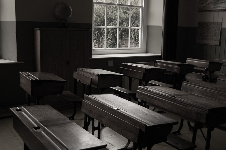
I was messing around taking photos today ,and it made me realise that I have quite a lot of photos that I am proud of that nobody will ever see, as they don't really relate to anything - so I thought for a change from illustration I would share some of my photos with you. Some of them are quite old but I am really happy with them yet haven't really done anything with them. They're not really related to each other, but they might make a nice collection. I'll try and reference any of the places in the pictures just in case you're interested in seeing any of the buildings for yourself.


(above three photos at Hartlebury Museum, Worcestershire)


(above six taken at the Lost Gardens of Heligan, Cornwall)


Boys swimming on a cold day in Clevedon

Birds circle the roof at Croome, Worcestershire

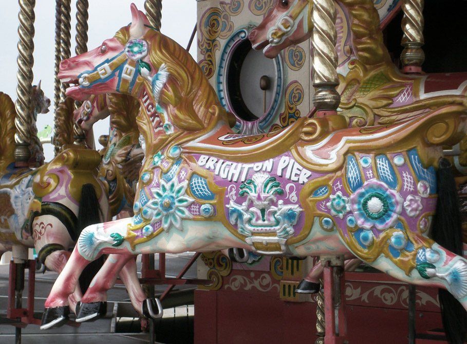
Carousel at Brighton Pier, East Sussex


Spires outside the Bullring centre, Birmingham

Saturday, 3 March 2012

telephones


Happy March! A quick one today as it has been too long. This isn't strictly new work, as the line work is the same as the first telephone from my phone series I did a while back. I decided to have a bit of a revamp of my twitter page this week (you can follow me here or through the live feed to the right of this post) and I fancied a bit of a colour injection so I had a go at creating a pattern out of my phones. I wanted to get some of spring's pastel colours in there and tie it in with my old favourites of brown envelope paper and hand rendered type! What do you think? Perhaps you can have a look at the final result and tweet me your opinions!

Tuesday, 14 February 2012

Valentine

It's time for some new work - after my logo design that I posted a few days ago I wanted to experiment more with using my trusty dip pen and a digital collaging technique that I had started to perfect on my phone illustrations as well as my Downton Abbey poster.

So then, I suppose if I were to be brave and rich enough to have a gigantic colourful tattoo it would probably look a bit like this...


This was also inspired by my good friend Natasha as I knew she would love to see a sugar skull style drawing! I'd love to hear any comments on what you readers think of this style. 

I suppose it's also a little bit lovey-dovey in its own crazy way, so consider this my Valentine to you all and all that I love - Happy Valentine's day! 

Sunday, 12 February 2012

mystery

Just a quick one today - Thought I would share a logo I have been working on as I would love to see what you all think! It's a little unusual! I've taken the type out of the image as I don't want to give away the name, I wonder if anyone who doesn't already know could guess what kind of company this is for? (I have also added a few squiggles to the ribbons just to protect my image from theft so sorry about those!).


I just produced this with my trusty Falmouth uni shop dip pen and some Trago ink, and added the colour with textures in photoshop. I had been playing around with scale and I have produced another logo with a bigger door and smaller ribbons, which I may upload at a later date. Enjoy!