Saturday 31 December 2011

final

So it's the last day of 2011, and the new year is on the horizon. It's been an amazing and dull year simultaneously, with my graduation happening and then...  not a lot else. Next year it's time to get me some serious move on, and get myself back into working and hopefully starting to forge myself a decent career.

For now, as a final goodbye to 2011, I thought I'd share with you the labels I did for my Christmas presents. It's a combination of my favourite things - victorian type, painting with gouache and food! These were printed on sticky paper and put onto gift bags.


The truffles I made were all eaten too quickly for me to take a good photo, but I can now reveal their lovely fillings as everyone has received their gifts. The first two fillings were taken from Hope & Greenwood's recipe book and I gave them some festive names. 


Happy New Year to all my readers and I will see you in 2012!

Monday 26 December 2011

R + J


A late Merry Christmas to you all! And a happy Boxing Day to my Brit readers. Today I wanted to share with you a gift I made for my friend Lily (the recipient of my home made Hogwarts letter) for her Christmas present. She adores the works of Shakespeare and I happen to know that this was one of her favourite quotes - "Did my heart love 'till now? Forswear it, sight! For I ne'er saw true beauty 'till this night" from Romeo and Juliet. I have also wanted to do a typographical poster for some time, so this seemed like the perfect opportunity. I wanted to keep it a mix of my typical favourite victorian style typography (which in this case I designed from scratch) and a calligraphy style type. I also included a surface pattern behind (the one I blogged before Christmas) and I chose roses as they are also referenced in the play (a rose by any other name, you know the line!)

I gave Lily the blue and white version of the print, which was only a print thanks to my great fellow illustrator friend Kat who kindly let me use her A3 printer! (She is simply fabulous, her blog is here check her out). The pink version of the poster below however still doesn't have a home, though I might put it into my portfolio if nobody takes a shine to it soon. Hope you like it guys!


(and here's a sample of the type up close)


Thursday 8 December 2011

patterns


Good afternoon! I've been working hard on a little secret project today but I wanted to share a little bit of surface pattern I was working on too. I do love drawing flowers so I drew a few roses from some photos I took a few years ago and put them together. I adore my dip pen today!

Wednesday 7 December 2011

truffles


Today I've been doing a little bit of painting pictures of food (no change there then) ready for some of my Christmas gifts. I had a go at making truffles (sorry if you are getting these and your surprise is spoilt) so I needed some images of them for the... I suppose you'd call it a chocolate menu? The fillings guide!

I found that making chocolates from scratch was actually pretty fun and not as insanely hard as I thought. I made a traditional style ganache truffle as well as two others with unique fillings. 

The recipes for the unusual fillings were from a book by the rather fabulous Hope & Greenwood that my brother got for me for my birthday last year, and beside the sumptuous recipes the actual writing in there is worth buying the book for alone - a very witty style that kept me entertained whilst endlessly dipping chocolates! You can find the book here (it also features some fantastic photography and lovely fifties style illustrations. It's basically the kind of book I would design if I were a publisher!) 


Here's some sneak previews of the actual chocolates - don't look, friends! The stars I used on the white truffles are Dr Oetker and you can get them from most good supermarkets or online here. I got the edible red glitter from a specialist baking shop in my local town but I found some online here if you'd like to experiment! 

I won't tell you what's in these - I shall save that until after Christmas! 


Update: Now that Christmas is over I can share with you the finished 'choccy menu', complete with details of the chocolate fillings...


Tuesday 6 December 2011

quizlet


Just a quick one today to share a poster design with you all that I worked on this evening. My dad is running the local pub charity quiz in a few weeks and wanted a little advertising so I thought I would step in! I have been feeling very Christmassy of late and got a little bit excited searching for typefaces, as I had to get this done quite fast and didn't have time to draw out my own font for a change! The festive type I used here is from this website though it's not entirely the same as the designer intended as I did edit out parts of the original type design. The candlelit background is some collage paper that I scanned in, I think it might be by papermania.  Overall I was going for the whole Tom Smith's crackers victorian postcard style aesthetic. Hope you like it!

Monday 5 December 2011

Angel


Tomorrow I am off to paint my third mural, and so I thought I would share with you some photos of the second one I did a few months ago. This is my interpretation of my customer's request to have 'an angel flying above a magical garden'. She had a look at some books and liked Pre-Raphealite styles (good taste that girl) so I opted for quite a traditional looking angel, and went for yellows and golds to offset the lilac walls. The garden is a mixture of different flowers, and I put in some bunny ears in the lower right corner as she loves rabbits. Tomorrow I'm doing a smaller piece (this one is about 12ft wide in total) which will be butterflies and a big flower. I'm quite enjoying this as a sideline of work, though so far I have only done girl's paintings, can't imagine what'll happen when I start doing paintings for boys!
Shall post some pictures tomorrow. 

Thursday 1 December 2011

festive


Hello everyone! Happy December to you all, hope you have all started your festive countdowns with chocolate today in the same way I have!
Just managed to get some last minute entries into a competition I found through the magic of twitter. The Design Museum and the House of Illustration have collaborated and are looking for festive illustrations to light up their "Sparkle the Dark Up" event, which will be projected onto the side of the building in all their festive glory! So I decided to put together some of my festive packaging images into some entries. To look at some of the other entries get over to their flickr page. 

Sunday 27 November 2011

hello! #5


Hello! Another quick telephone post to brighten up your Sundays. I saw in a magazine last week that telephones are everywhere in interior design supposedly - looks like I accidentally hit a trend! Soon I plan on making some of these little phones available as postcards or greetings - please comment or get in touch if you think that's a good idea or something you'd be interested in! 

This little baby has a kind of 40s Gatsby kinda kick. Enjoy.

Thursday 17 November 2011

hello! #4


I thought that I might as well post this seeing as I had finished it. My fourth lovely telephone. This time I went for a lovely retro Trimphone in an elegant khaki style green. Complete with matching wallpaper. Lovely.

hello! #3


I thought my last blog post was uncharacteristically wordy so I wanted to publish some more illustration. 
So here it is: a third little illustration for my mini series of telephones. This time I opted for an old fashioned edwardian-ish phone complete with eau de nile colour and gold coloured finishings. Fancy. 

Wednesday 16 November 2011

Pre-Raphaelites - Manchester Gallery & Lady Lever Gallery

Yesterday I went on a Pre-Raphaelite tour of the north - Manchester Art Gallery and Lady Lever gallery at Port Sunlight. It was a fantastic (though long!) day and I ended up getting much more out of the day than I had expected! Here's my potted review of the galleries...

The first stop was Manchester, for the Manchester Art Gallery and in particular their exhibition "Ford Madox Brown - Pre-Raphaelite Pioneer". I had no idea how central the gallery was when we drove through to the heart of the city, and it is a very impressive sight even though it is stuck in amongst more modern buildings.

Their permanent collection of Pre-Raphaelites is an impressive one, displaying some of the finest examples of the movement ranging from The Light of the World by William Holman Hunt to Arthur Hughes' Ophelia. These paintings are definitely worth visiting and seeing face to face, as the vibrancy of colour used particularly by Hunt must be seen to be believed.


The Light of the World  by William Holman Hunt. You can see here why you need to see it in the flesh -this does it no justice! 


Arthur Hughes' Ophelia. This also has a lovely frame that is worth seeing (!)


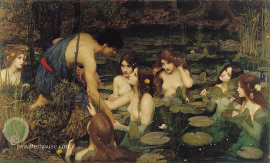
I was only just getting over the brilliance of the collection in the room I was in, only to go through and see an even more impressive selection. I had not anticipated walking into a room and being met by Waterhouse's Hylas and the Nymphs, as well as Rossetti's The Bower Meadow - it was a fantastic surprise! These two images are two of my all-time favourite paintings, and it was amazing to see them in the flesh, particularly to appreciate the level of detail that goes into the works. (If you like me are a fan of Waterhouse's Nymphs and Rossetti in general, similar paintings including Dante's Dream by Rossetti and Narcissus by Waterhouse are at the Walker Gallery in Liverpool).


The Bower Meadow by Dante Gabriel Rossetti


Hylas and the Nymphs by John William Waterhouse


We then went to look at the main event exhibition, devoted to the artist Ford Madox Brown. It was a fascinating exhibit (appropriately sponsored by Farrow & Ball, which for some reason entertained me greatly when glancing around at the muted exhibition wall colours) and had an impressive collection of his pieces including the astoundingly detailed piece Work, painted between 1852-63. The painting is supported by a collection of preliminary sketches and roughs which really help the viewer to understand the painstaking work that goes into such an elaborate painting. Also in this exhibition were sketches from other famous paintings, designs for stained glass windows produced alongside William Morriss and a number of other famous works including Pretty Baa Lambs and The Last of England.

I myself wasn't as impressed with the Ford Madox Brown exhibition as others, not because it was an unsatisfactory exhibit at all, but because I had seen one or two of the works before. As a Birmingham girl, I have visited the BM&AG (Birmingham Museum and Art Gallery) many times, which is where many of the pieces for the exhibit had been borrowed from, so it felt a little familiar at times. However, this doesn't take away the impact that pieces like Work and The Last of England have on the viewer, and it made me even more enthusiastic about enjoying the pieces that were not from the BM&AG including the window designs, family sketches (his sketches of his sons as babies are amazing, don't walk past them they're right in the corner!) and Brown's entry to a commission competition to paint a patriotic mural in London.


The Last of England by Ford Madox Brown


Work by Ford Madox Brown


The Manchester Gallery also houses a fine collection of paintings by one of Manchester's pioneer artists, L.S. Lowry, as well as collections of paintings from the 17th and 18th centuries, including works by renowned artists Gainsborough, Reynolds and Stubbs.


Our next stop was a little drive to Port Sunlight, the purpose built village that housed the factories and workers of the Sunlight Soap company. Inside this spectacular village is housed the Lady Lever Gallery, a memorial gallery to the wife of William Hesketh Lever, founder of the Sunlight Soap company. This gallery houses another collection of PreRaphaelite painting, which is arguably even more impressive than those in Manchester. There was one painting in particular I knew that was here, which I had determined to see ever since first seeing a copy of it in print - The Scapegoat, by Holman Hunt.

I was not disappointed. On entry to the first room, it is just to the right and has all the dazzling impact I had expected. Ok, so it's a painting of a goat, but still! It's what is behind the goat that I am interested in - the amazing colours of the far eastern landscape that were so truthfully captured by Hunt, and the incredible attention to detail.


The Scapegoat by William Holman Hunt. This definitely needs to be viewed in the flesh, just look at his little face...  but seriously, this does it no justice!


After this initial viewing I thought it wouldn't get much better, and for a while it didn't - Bubbles is on the wall in the area to the right of The Scapegoat, an image that is impressive but that I am not overly fond of. However, in the room on the opposite side of the building there are so many of my favourite paintings it was hard to decide which one to stare at for the longest! Rosetti's The Blessed Damozel needs to be visited in person just so that you can behold the incredible frame it is housed in; The Beguiling of Merlin by Edward Burne Jones is so beautiful that no print image can truly do it justice; equally The Tree of Forgiveness by Edward Burne Jones is quite breathtaking; and the attention to detail in May Morning on Magdalen Tower by Holman Hunt, a painting I had not even seen in print before, was incredibly rich and full of bright light.

 
The Blessed Damozel by Dante Gabriel Rossetti, a work that was completed in sync with this poem also by DG Rossetti.


The Beguiling of Merlin by Edward Burne Jones


The Tree of Forgiveness by Edward Burne Jones. It is worth going to gallery to read the beautiful story behind this painting alone, let alone to see it in real life.


May Morning on Magdalen Tower by William Holman Hunt


By this point I was all Pre-Raphaelited out - it truly was a brilliant collection. Also housed in the gallery are (what I would call less interesting but equally awe-inspiring) other collections, including a small collection of pieces by Reynolds, an entire collection of pottery by Josiah Wedgwood including an imposing Wedgwood fireplace, and a large collection of (apparently historically important) Greek urns.

All in all, I did not go home disappointed, and I highly recommend a visit to these galleries if like me you are a Pre-Raphaelite fan. I also feel it is worth mentioning that both of the art galleries are free entry, so even if you are a bit poor like I am at the moment you can be inspired by art.


Manchester Art Gallery is open Tuesday - Sunday, 10am - 5pm. Free entry.
"Ford Madox Brown - Pre-Raphaelite Pioneer" is now closed.
The Lady Lever Gallery is open daily, 10am - 5pm. Free entry. 


(Copyright of images to their respective galleries and owners, of course, as they are clearly not mine!)

Sunday 13 November 2011

hello! #2


Second instalment of my new mini series of illustrations. I really did enjoy drawing this Hamburger phone.

hello!


Just a quick post to share one of the things I have been working on recently. I have always loved drawing little random objects, and since one of my meetings in New York when I was advised that this is one of my strong points, I decided to stick with it. I've started working on a short series of spot illustrations (can you guess the theme?) and this is the first in the set. I might use these for a more constructive purpose in the future but for now...

hello!

Thursday 3 November 2011

festive


Hand drawn Christmas holly themed typography

Continuing on the theme of being way too prepared for Christmas, I wanted to share with you a little of the work I've been doing on my own gifts ready for the big festive season. I designed a Christmas-themed font for all of the different elements of my gifts, and have been busy designing labels for different things just to give my gifts a more personal edge. I can never get away from my love of Typography so this was the perfect chance to get some festive designs ready.

 (Anyone reading this who I will be giving the following gift to - I hope this doesn't spoil the fun when you receive yours! it tastes good, trust me I've tried it!)


Handmade Mincemeat in personalised jars


This year I decided to make my own mincemeat, as I have often wondered if it would be really that difficult. Turns out it's not, at all! I opted for our national treasure Delia Smith's recipe which can be found here. Then I simply customised the jars with Christmassy fabric, print out labels and festive ribbon.  


Wednesday 2 November 2011

Skull


Recently I have been working on a submission for 'The Big Skull Collab' over at this blog. I found out about the project through twitter (of which mine you can follow here should you want to) from the good people at Illustration Rally who shared the link a few weeks ago. I sent my entry in yesterday and so I thought I would share it with you here (hoping I'm not sharing it with you too early!). The skull itself was illustrated by James Fenwick, the illustrator who started the collaboration, and the rest was all me - I wanted to go with the whole candy-land gingerbread theme I have been painting recently (you may notice a recognisable gingerbread man has snuck his way into this piece) as I found that it had been inspiring me. It's kind of crazy and a little bit overwhelming but I wanted it to be crazy detailed! and I think it'll be pretty different to all the other entries. If you are interested in submitting something for this collaboration there is still 9 days left before it closes and you can get more information from the Dead Fuzz blog.

 Will continue with this theme for another few projects hopefully, and I will soon be starting something type-based that will hopefully be very exciting, so keep your eyes peeled!

*edit 9th Nov* Just a quick addition to this post - if you'd like to see my fabulous friend Natasha Aldred's submission to this competition go here, it's a wonderful blog!

Saturday 15 October 2011

gingerbread

Ok, ok, I know. It's not 'the C word' *ahem*Christmas*ahem* for another ten weeks or so. However, I have been dabbling in a little early Christmas spirit as I have been designing for parts of my personalised presents that I will be giving out to family and friends this year. I have been having fun with paint again (hooray!) and going back to my old favourite of food. These paintings were so much fun, I particularly loved doing the gingerbread house. I also designed the snowflake pattern in the background of these images. I got the colour scheme of the pattern from something I did last year for the They Draw and Cook holiday recipe contest.

I hope to go back to painting food for some of my promo material that I will be working on next, so watch this space! Maybe in a few days I will post some slightly more appropriate seasonal material and do a pumpkin or something? who knows.


 Gingerbread men and candy canes. yuuum.


Gingerbread house - I hope the one I make this year looks this good...

Tuesday 11 October 2011

quotes


Hello again. I am posting today because I made a to do list, and when making this list I realised that I still haven't posted a photo of my page in the UCF Book of Illustrated Quotes and Sayings. So here goes! I purchased my copy from our final degree show private view, but you can get yours if you would like one from Amazon here once they are back in stock. All the illustrators that are in here can be seen on the Agency website. Not only is it a great collection of illustration it would help toward the students that are currently studying there to make their book. Ok, plug over.

I'm also working on various projects relating to Christmas (early argh) but you will get to see some of them very soon hopefully. I'm off to cross the first thing off my list!

Monday 10 October 2011

wightwick

Just a quick post today. Been busy buzzing around to London and back last week so I couldn't post, hopefully some exciting promo stuff inspired by that trip coming up soon. But in the meantime, today I was working on another chalkboard design,  this time for the 'malthouse' tearoom at Wightwick Manor in Wolverhampton, an amazing mid 19th Century mock-Tudor building that was once home to the enterprising Mander family. If you, like me, love Pre-Raphaelite art and the Arts and Crafts movement, it's definitely worth a visit as they have loads of amazing William Morris patterns and a few pretty incredible drawings by Rossetti. 


Wightwick Manor, Wolverhampton

Anyway, the tearoom there was in need of a large display board for the wall so I offered my type skills for the job. I kept the main body of the type as close to the National Trust's standard font as I could by hand, but the main title was inspired by an old book I once got from the Falmouth uni library about Victorian typefaces.  It'll be up there in the tearoom some time this week I believe! 


Friday 23 September 2011

survival


Recently I have been working on a booklet as a gift for my friend (illustrated above!) who has just moved into her first student house. The main reason I wanted to write this booklet for her was that I was aware she was moving into a house with seven other people, something which I experienced during my second year of university. I remembered how hard it could be to live in a normal sized house but with so many people and I wanted to share the knowledge I had gained from this experience. 
I also knew that, as she admitted herself, she wasn't the greatest culinary whizz, so I also included several recipes and useful tips to get her started. To make the book special I decided to do some quick, light hearted little spot illustrations to brighten up the pages. 


After presenting her with the book yesterday I have decided now that it's no longer a secret to share a little extract with you all - and the section I have chosen to share is the list of useful utensils you'll need in your student kitchen. I hope any fresh students that are reading this find it useful, and I also hope that any not so fresh students agree from their own experience that my advice is informative! 


Useful stuff to have in your kitchen

"In a student kitchen there only needs to be a few utensils to make your life easier. I start this list with one piece of advice – unless your flatmates are wonderful and all use their own personal plate, make sure you have one clean plate before you cook as there is nothing worse than having to wash a plate to eat from when your lovely meal is all ready and going cold. The following bits of kit will make it easier to make my recipes as well as other simple staple meals.

A wok  - This is the perfect pan for a student kitchen. Not only is a good wok useful for frying things such as onions or mince, it can also be used as a pan so that everything you do can all be in one pot – and that means less washing up!

A good knife – if you’re cooking meals from scratch it’s a good idea to have one good knife to chop all your vegetables and meat – though don’t forget to clean it before and after washing chicken.

A chopping board – for all that chopping of course. If you can get a plastic one that would be good – but a wooden one is perfectly fine, just make sure you wash it quickly after chopping chicken.

A colander – good for draining your endless meals of pasta! You can also use a sieve for this if you don’t have a colander. A colander also makes a brilliant robot hat for those freshers parties. 

A measuring jug – how else are you going to make gravy my darling?

A good can opener – for the days when you want to ignore my recipes and get out a can of beans and miniature sausages.

A potato peeler – for that yummy mashed potato that we all know and love.

A slotted spoon – good for serving your peas and getting pasta out of the pan to check if it’s done.

A cheese grater – because buying pre-grated cheese is simply on the unacceptable side of laziness.

Other useful things that are fairly obvious are – a good wooden spoon, a decent set of cutlery, a mixing bowl, a spare bowl (so you can put the leftovers in the fridge for the next day) and if you don’t have a wok I recommend a decent saucepan and a good frying pan."


Hope you enjoyed my little snapshot of my booklet, I might post a recipe from it in the next few days. 


Thursday 22 September 2011

bakery


It's been a bit of a large break in between blogs at the moment as I have been working on lots of different things. Today though, I can reveal something I have been cooking up 'Willy Wonka' style for my friend Amber's 18th birthday. A few months ago, she found an image of a rainbow cake and asked me if I thought it was possible to make - so I decided to make one for her birthday. I settled on a brilliant recipe from a blog called The Whisk Kid, whose recipe was not only fantastically written and easy to follow, but the photographs were to die for! So much so that it made me want to be a food photographer for a long time after I read this recipe...

 Anyway, I managed to get some Sugarflair gel food colouring from a brilliant local shop called Angel Cake (which you can also get online at places like this) and after two days of mixing with six separate wooden spoons and icing with a massive spatula, I arrived at the cake. Here's a few pictures of my progress (sorry for the quality, ridiculously bright cake batter and camera lenses don't mix!)


Part of the mixing process - it's a good job our kitchen is heavily overstocked when it comes to bowls and wooden spoons!


The finished cake - I opted for a lilac buttercream over a white crumb coating to hide the cake's gloriously colourful centre.


The offcuts of the trimming process demonstrate how bright the final product was!


 I presented the cake to her this morning in a custom cakebox, with a logo on the lid that I designed myself (above) so that she has something of the epic cake to keep once she has eaten it all. I even managed to sneak a piece of cake for myself and managed to get a couple of better quality photos for you.


Happy 18th Birthday Amber!